Things are winding down, I should be back to blogging in about a week. Until then, here's a link to the Vindicator website which I FINALLY got designed an online: www.csuohio.edu/vindicator
It's not exactly finished... the pictures are largely unlabeled not because I'm going for some ultra-cool minimalist look but because it was 5 am. The labels that do exist aren't haphazardly slapped on the photos because I have no design sense (I hope) but because it was... yes, 5 am.
Showing posts with label design. Show all posts
Showing posts with label design. Show all posts
Friday, May 02, 2008
Website


Friday, March 28, 2008
More Creative Gift Wrapping (procrastination)
 Because everyone knows a small child would MUCH rather admire a prettily wrapped gift than, you know, open it, I decided to have some fun with a birthday gift for Matt's (and soon my) niece. I probably wouldn't have bothered except that it was one of those multiple book gift packages that looks all weird and asymmetrical when you're done. Plus I had some time to kill that I could have easily used for more productive things.
 So... I took some of the silver paper that I used last week (or whenever) and cut out a bunch of rectangles. I Folded them all around to give them sharp edges and taped them on (sticky side in). Best find? Random Izzie (a juice soda) bottle caps all over the floor. We never throw them out because they're kinda cute and the cats like to play with them. And we're slobs, that's probably one of the reasons too.
Anyway I put it all together and I can sort of kind of pretend it looks like a car. What do you think? Am I not the queen of wasting time?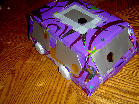
Tuesday, March 25, 2008
Decorative Gift Wrapping, AKA Thesis Avoidance
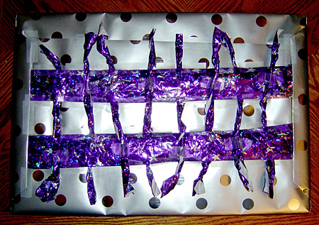
No... we still haven't managed to get out all the Christmas presents. We're horrible. Anyway, now that that's established, I wanted to show everyone my latest adventure in gift wrapping. I've been getting more adventurous about wrapping gifts which translates to: sometimes I really really want to waste some time. This weekend I needed to wrap up a big flat gift for a friend of ours. Initially I used the silver wrapping paper with... uhm... extra silver dots. The thing about big flat boxes, is that when you wrap them, even if you're really good at getting a tight wrap (which I'm not) they end up looking kind of sad and lame. It's the sagging in the middle. So I decided to add a couple of purple stripes from pre-used wrapping paper that I hadn't bothered to throw out yet.
 Since the paper was kind of wrinkled I wrinkled it some more, so it would look intentional instead of just rude. Then I folded over the edges of the stripe to make them smooth and pushed each end under the already folded up silver paper.
It still looked lame.
I decided to put a kind of woven pattern across the box with the remaining purple paper. I ripped the paper into eight strips slightly shorter than the width of the package. I started out with seven but with what I ended up doing it made the package look asymmetrical (in a not good way) so I went with eight. When I had them all torn and wrinkled, I twisted each piece lengthwise, and wove them under alternating sides of the two long stripes. I taped the ends of the stripes down around them to hold them in place and then taped down the loose end on the other stripe. The effect was nothing at all like a basket weave, more like an extended tic-tac-toe board, but it did fill the space much more effectively than the two lone stripes. It ended up looking kind of cool, I thought... in a this gift has tentacles and wants nothing more than to eat you kind of way.
 Anyway, using these creative avoidance techniques I was able to waste nearly a half hour of time that could have been spent toiling away on my novel. With some work, you too could waste lots of time constructing something that one of your friends will almost immediately tear into shreds. Good luck!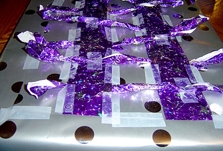
Monday, March 17, 2008
Bumper to Sunroof
 I'm always thrilled when fantasy and sci-fi stories bring in elements that aren't normally a part of our consideration of the future. There are things we love to imagine futuristic versions of: weapons, costumes, computers and entertainment, but many things are off our radar entirely. You don't often see futuristic toilets or children's toys. We're all familiar with space ships and funky flying cars, but rarely does a story spend the time to consider the changes these vehicles would create in traffic.
In the original Star Wars trilogy for example we saw hover crafts and flying scooters, but it wasn't until the prequels that we saw an example of 3-D byways. Star Wars was revolutionary in some ways, but in spite of gravity defying technology the designers obviously had their feet firmly planted. Even in Phantom Menace, the mind blowing pod race (which some consider the only saving grace of the film) was relatively two dimensional. The race was not so different from a car race or a dirt bike race, only a hundred feet in the air. Space battles were fought in all directions but planet side, the designers seemed to have put little consideration into how to use a space less effected by gravity. The first time we saw a third dimension added to traffic in the Star Wars universe was in Attack of the Clones, when Anikan and Obi Wan get into a speeder chase scene. Here we had a deep city full of traffic with layers upon layers of invisible highways.
I have great respect for the designers of the Prequel movies (if not for the writers) but I find it difficult to give them credit for the clever vision of futuristic traffic presented in Star Wars II. The visual effect of the Star Wars traffic was so similar to the traffic created in another chase scene, out of 5th element, that I have to believe the Star Wars design was at best heavily influenced.
5th Element came out in 1997, Star Wars II came out five years later. More persuasive, while the traffic in Star Wars reads as background, it actually played a role in 5th Element. One of my favorite details in any science fiction movie is the Portable Chinese Restaurant, modeled to look like a boat (and why shouldn't it be?) that stops at Dallas's window. The traffic in 5th element isn't just filler, it's almost a separate character. This is fitting as Dallas is a cab driver. Some other examples of good traffic scenes can be found in Firefly, the most recent Dr. Who series and probably lots of Anime. In Dr. Who you get to see a never ending traffic jam, where people are living (and dying) while stuck in traffic, and nobody knows that all the exits are closed. Another movie that brought an interesting take on 3-D traffic was Minority Report, in 2002. This vision of the future seems a bit nearer than Star Wars (yeah I know that's technically supposed to be "a long time ago" but it's futuristic, deal with it) or 5th element. The cars don't fly, but the movie utilizes 3-D space with the roadways, which twist around each other in all directions. The traffic itself is far more organized than movement in either 5th element or Star Wars, which could be read as a reflection on the society it represents: highly ordered and over-regulated. Cool looking though.
*Images link to their homes.
Tuesday, March 11, 2008
Unfortunate Combinations
 If you've ever worked with OCR (Optical Character Recognition) software, software designed to turn scanned papers into editable text, you may have noticed that certain letter combinations are problematic for the computer. "cl" is often read as "d," "lc" turns into "k," and "rn" becomes "m." These aren't the only combos that cause trouble but they're the most common ones that I remember.
I would assume that this problem occurs more often with certain fonts and sizes, or with documents that are less clean, printers that are lower quality. While I can see how the characters resemble each other, I'd always though of this as a uniquely AI issue, until I found myself doing the same thing a couple days ago when checking my yahoo account.
One of the combinations I didn't mention was "ol," which potentially turns into "a." I didn't mention it because it's not a problem with most fonts. In most typefaces the "a" is as it appears here, with a... er... thinggy? curling up on the top and at the tail end. The "a" can appear though  as a circle with a barely curved line at the end, like an "ol." I made this mistake momentarally when I saw a granola bar ad from the corner of my eye. Maybe I was just tired. Personally though, If I were the designer, I'd be more careful about which font I used if I wanted to describe a product as having a "bold" taste. Or maybe he just doesn't like them.
Monday, February 11, 2008
Grand Central Improv
As with the Obama music video, everyone has probably already seen this, but I wanted to post it just in case. This is the (probably) latest stunt by Improv Everywhere, a group that gets hundreds of people together to cause "scenes" in public. You can look at their events as anything from a practical joke to an interactive work of performance art. I believe they're most famous for the blue shirt prank at Best Buy a few years ago.
This video in particular is actually a wonderful example of people interacting creatively with their spaces. One of the things that makes these scenes so brilliant is that they executed and then abandoned without explanation. I'd have to think that witnessing one of these scenes would be pretty shocking... in a good way.
Craziness
This week's another crazy one.
While I've got a few minutes, I wanted to mention that I'll be making some changes to this blog. The theme, which is currently vaguely defined as looking at design, or looking at the way we interact with our spaces, or... well, actually it's not really defined at the moment, will be changing (I think). I'd like to start talking about design in fantasy. I'll go into a bit more detail later this week to explain what I mean by that. I hope to post about three times a week but continue (ha) my daily drawings and photos although they'll have nothing to do with the blog theme. We'll see what I decide to do with that in the long term, I'm pretty attached to both even though I've been pretty bad about posting drawings lately (including tonight, there will be no drawing tonight).
More later this week.
Monday, February 04, 2008
Shooting themselves in the shoe
 I noticed something interesting the other day when Matt was shopping for new dress shoes. Many men's dress shoes these days have gel pack insoles to make some part of the shoe, in this case the heel, softer than the rest. This isn't really surprising or even that new. What was interesting is that in most cases these insoles were intentionally left visible.
This seems to be a trend with shoes in general, though less so with dress shoes. New advances are made in shoe comfort and the shoe designers decide to make it extra visible to advertise that the wearer is sporting the very latest in shoe technology. Or something. This is not normally possible with dress shoes, but since this alteration is on the inside, the manufacturers can make it obvious to the buyer at least, that they've used the utmost of shoe technology to ensure their comfort.
There's one problem with this, which Matt found much to his sorrow. For someone with a sensitive foot, the edge of the gel pack is noticeable, and has the possibility of growing uncomfortable if not painful.  Matt had some problems with one of his feet a while ago and, though he liked two of the shoes he tried on, decided not to buy them because of the visible insole. The silly thing is, that edge would probably not be a problem if the manufacturers chose to cover it with even a thin layer of fabric. If that wasn't enough to do it, I'm sure the padding required would be minimal. Then the wearer could get the benafit of the technology without the inconvenience of that plastic edge. I can almost hear the designers saying: "but then how will the customer know that this shoe has the very latest shoe technology, which is of course very important?!" I wonder if anyone's done some kind of survey to see how many people are more likely to buy a shoe because of the visible element (and I'm sure that actually does have a positive affect on sales) verses the number of people who will not buy them due to feeling the visible element. Any thoughts?
Monday, January 28, 2008
Holy Politics Batman!
WOW! Did anyone else hear the endorsement in tonight's Democratic response to the State of the Union??? Towards the end of her speech, Kathleen Sebelius, Governor of the State of Kansas, said: "We are tired of leaders who rather than asking what we can do for our country, ask nothing of us at all." Now this isn't particularly shocking rhetoric, after all Kennedy is still one of the most loved presidents of all time (yes I know some people hate him), and those are referencing some of his most famous words. If it weren't for the timing I'd say it was a pretty typical comment.
But in politics EVERYTHING is intentional and because of today's endorsement from Ted Kennedy and, even more key, yesterday's Op-Ed by Caroline Kennedy entitled, you ready for this? A President Like My Father (!!!), Barack Obama is at this moment, more than any other, connected to J.F.K. in the minds of Americans.
I'm a little floored by this. Does anyone else think this is huge, or am I reading too much into this?
*Photo and transcript from CBS but NPR is still my favorite.
UPDATE: HA! NPR says the same thing. Look slightly past halfway down. I rock.
Stalking the Election
 For the last few years I've been a bit obsessive about elections. Ok, specifically, since 2004. In 2006, I was so excited about the prospect of Republicans getting the boot that as the evening results came in I sat by my computer on an election website, hitting refresh every ten seconds, and listening to the radio for any new results (no TV). When Ohio voted in a Democratic senator, I ran into the other room where Matt was on a conference call and waved around a piece of paper where I'd written in sharpie: "Ohio is a BLUE state!"
I'm a visual person (duh) so I find it easier to process election results with charts and maps, and side by side comparisons. Yesterday, after finding out that Obama beat Hillary in South Carolina (boy did he ever!) I was looking around for some visual explanation of what exactly it meant, and preferably, for a reminder of the past few primaries and which of them actually mattered (anyone else finding this year's election more than usually confusing with all these primaries that don't count because they're too early etc?). I looked on MSN, where I spend more time than I'd like to admit, and CNN and couldn't find much, I mean, I know it must be there SOMEWHERE but I couldn't seem to run across that.
Haven't any of these news sites heard of ease of usability? People do want election specific results (I can't be the only one) and a page dedicated to that is expected. Maybe they even have one and I just couldn't find it. But seriously? I could have designed a much better path to election results.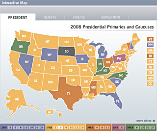 So finally it occurred to me to check NPR's website, the site I'd haunted in 2006 and the station I'd been listening to. They had *gasp* a page dedicated to the election and, wait for it, graphs, maps and yes, side by side comparisons. I gotta say I'm a little disappointed in CNN. I'd always considered them the basic, unbiased source for finding out what's going on, but lately they've been getting more rating hungry, using fearmongering that would make Bush jealous, and apparently, giving a lower quality of information. I've trusted NPR since I started listening to it, but I always think of NPR as focusing on more human interest, unusual, slightly off the beaten path stories, with news news taking only about half the attention. You know, stories on cow farmer struggles in Wyoming and the high level theoretical discoveries by some Canadian physicist VS. weather, war and ELECTIONS. A bit more widely spread is what I'm saying. So that NPR's site is that much more effective and easy to use is, while commendable for NPR, kinda pathetic of CNN. Anyway.
What I'm really getting at is the long awaited announcement that npr.org/ is now the OFFICIAL ELECTION WEBSITE of Meagan B. Call and Hades Arrow Incorporated (there's not really any incorporated, it's just me). I Meagan Call do endorse NPR. I know the suspense has been killing you.
*Images from NPR... possibly illegal but I'm ENDORSING them, to all five of my readers, hello! Right, anyway I'll take them down if someone (someone from NPR that is) asks me.
Thursday, January 17, 2008
Stuff It
 Last night after fencing I was talking to my brother and he pointed out something about fencing bags. They're STUPID.
The typical fencing bag contains 3-5 weapons (in our case epees) a mask, several body cords, shoes and glove. Most fencers also shove in their uniform, knickers (you may giggle here) and jacket, underarm protector (which is hardly ever used but required for competition) and if you're female, a chest protector on top of everything else. A smart fencer (which I am not in this respect) will also have a fencing tool kit, extra parts (tip screws, tips, springs etc) a granola bar (or five), and Gatorade or a water bottle. I like to throw in a bar of ivory soap because I pretend that it keeps it from smelling to bad (eventually the stench will always win). You can get a cheap fencing bag for about $20. These are small with a single main compartment and not really intended to carry anything but weapons, although I've seen people manage to shove in other things. Sometimes they have a side compartment for body cords. Like most bags which are designed specifically for fencing, these bags are cloth or vinyl. The cheap bags have no hard parts, so without weapons inside they can be crumpled up into a ball. They are kind of wedge shaped, and carried over the shoulder so the heavy thicker part, which contains the grip and bell-guard part of the weapon, hangs towards the bottom. Since these can't hold much, they don't put much strain on the back, but that's not much of a consolation since you've got to get another bag to carry the rest of your crap. An alternate cheap design is symmetrical, either tubular or "lumpy." These hold a bit more since you can alternate the direction of the weapons and shove a mask or so in the edges, but they can get heavy and often don't hold up all that well (though I'm here to tell you, my soft lumpy ND bag still doesn't have so much as a hole after eight years).
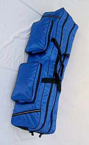 Nicer bags have a hard bottom and have wheels on one side. The bag itself is still cloth or vinyl. These start at around a hundred but can get into the three hundreds (or more). Top of the line bags have two long main compartments, three smaller side pockets, and often come with a smaller long bag that straps on top (which is in my humble opinion totally useless) that is intended to be used to carry just a couple weapons around at a time. I got a $150-200 bag in high school. I got it at the end of the season (so I got a good bag for the price) and it was a name brand, so theoretically decent quality, but after only a year it had some decent tears in it. In all fairness, this probably wasn't the maker's fault; when you travel a few times a year with a soft bag that has hard metal objects in it, being handled by well... I don't think it's necessary to go off on bag handlers (that's an entirely different post), it's not that surprising how quickly a bag's gunna show wear and tear. In fact I think the wheeled bags are more likely to show the wear, because they have cloth attached to wood, which is easily strained, as opposed to all cloth, which just moves with the bumps (then the stuff inside gets to show the wear instead). Nonetheless, $200 is a lot to pay for something that's going to have holes in it after a year. The cheaper bags will go even faster. They're also bulkier than the soft ones which gets to be a pain in the ass when you can't use the wheels.
 The biggest problem though is that, while the side pockets are good for all the little crap you carry, the inside compartments aren't really well designed for anything else. You have two compartments, but the only thing that really fits them properly is your weapons (and that's debatable due to the weird shape). The mask gets shoved in, usually with a bell guard or two in the back so it can fit, the shoes are shoved on top, and if the fencer forgets the consequences (rusty blades and rust stripes on the fabric) the uniform and glove are often tossed on top as well. If you remember, the 2nd compartment can be used for the uniform and other sweaty and wet stuff, but it all lumps up awkwardly because it's a long space for not long things. All in all it's an uncomfortable set up, not good for equipment, and frustrating to use.
Again it's not really the fault of the makers, the reason this is so awkward is because the equipment itself is oddly shaped and hard to combine. And unlike in more glamorous sports, we can't just pack it all separately and hire a caddy or bat boy to lug it around for us (nothing is not nearly enough pay to do things like that). Tomorrow (or whenever I get around to it) I'll post what I think the ideal fencing bag would be, along with creative solutions that fencers have come up with to make their bags more functional (or at least cheaper).
*The last image is mine. The others are from gofence.com and linked.
Wednesday, January 16, 2008
University Design
This is a picture from of the University Center at Cleveland State. Though I'm generally not a fan of this type of blocky architecture, I actually really like this building because of all the space and light in the main area. 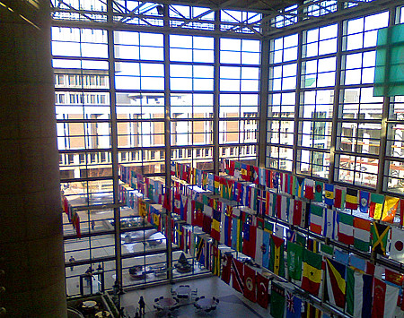 The Vindicator just recently moved from a basement office in this building which was horrid, when I used to do my office hours during the summer, I'd do as much as possible in the open area which is fully equipped with outlets and wireless (the building's wireless is typically spotty in the basement). It's also a nice place to study or read or just hang out and relax, though it gets a bit loud during the time between classes. You just feel so much more free in the space, and more willing to work on things. Ironically it's nicknamed "the cage" because of the resemblance to a bird cage, and also because there are always a number of actual birds that have managed to get themselves stuck inside.
  Unfortunately, this means most of the chairs and tables give testament to the avian residents. Still, I like the space, which almost feels outdoors (very nice on a rainy or snowy day) so I'm a bit sad that it's being torn down. I'm not sure when exactly they'll get around to doing it, but it makes sense: It must be a nightmare to heat in the winter, to cool in the summer, and it's falling apart. The basement office dripped, right into the lights and over the computers so real great. So I understand why they're doing it, but it doesn't mean I'm thrilled about it. Especially when I look around at all the ass-ugly buildings that AREN'T being torn down.
*I got home from fencing late and then it GOT late so this is the extent of my blogging today, which is why it's combined.
Tuesday, January 15, 2008
Wedding STUFF
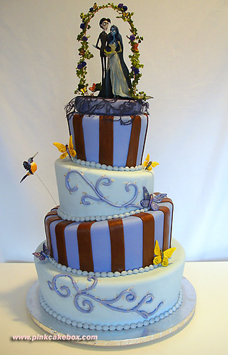 So Matt and I are getting married in about ten months. This is wonderful and exciting and slightly terrifying. Not, mind you, terrifying in the "oh gods am I doing the right thing" sense, but rather in the "HOLY SHIT WE HAVE SO MUCH TO DO" sense.
We were supposed to get Save The Dates out before the end of the year. Oops. By all polite wedding schedulers we're probably supposed to have actual invitations out soon. Oops, oops. Half of what we're supposed to do I probably can't even think of.
I was intending to do up a design for Save the Dates today for my drawing, but... I'm in an extremely lazy mood. I'm feeling very blah and apathetic today. It's the new start of a semester, and I'm suddenly (or not so suddenly) horribly sick of being a student. It's not the classes (although I'm thrilled to be on my last one) and it's not the novel, it's just being in school. I'm ready to be OUT. I guess it's about anticipation. Anticipation of actually finishing a novel (and proving to myself that I can), anticipation of not being in school anymore, anticipation of finally being married... added to the enormous amount of stuff I and we need to do between now and then. Has anyone else noticed that the more you have to do, the harder it is to get anything done at all?
*I'm lazy and a horrible person, so I usually don't bother to actually write down credits for photos... I just link them. Today however I'm so impressed with the cake that I want to encourage you to visit this lady's flickr site... she has tons more seriously cool nontraditional wedding cakes. Her user name is PinkCakeBox. I urge you to check it out purely for visual enjoyment.
Friday, January 04, 2008
Market Days
Whenever I go to Eugene, I try to get to the 5th street market at least once. Since it's only a couple blocks from the grill (where my mom tends bar), this isn't hard. I love the open feel of the market. While it's not quite as lively or quintessentially Eugene as the Saturday Market, the 5th street market has a relaxed atmosphere and wonderful, recently upgraded design. One of the downsides to the recent renovation is that they consolidated what was an entire wing of the market into a single shop, this is for local crafters and artisans. It's a shame that the local artists get less of a footprint there, but at least the new shops are still locally owned.
 It's a bit more upscale than it used to be, which may be a response to Eugene's aging hippie population. If I wanted to be judgmental I'd say it's more yuppie now than hippie, but since I enjoy the shops that do fill the market I'd rather not go there. The second floor has a fantastic little shop of African imports, which is at least some replacement for an imports shop specializing in Egyptian items that used to be across the way. I don't mean to imply that the content is at all similar, it's only similar in that it's unique and exotic.
Just below the African shop is a furniture store with some of the coolest toy chests I've ever seen. It's way out of my price range, but I've never seen anything quite like the colorful creations. On the third floor, in kind of a crappy location, there's a funky little witchy store with little pagan and gardening decor type stuff. The Elephant's trunk, a somewhat expensive but very nifty local toy store, and Destinations, a quirky travel shop, are across the bridge, over a Japanese furniture and decorations store and a pet accessories shop. It's a good assortment with a fantastic layout that encourages leisurely browsing and enjoyment of the surroundings rather than the rushed aggressive shopping usually pushed in our consumer culture. The wing which used to have all the artisans is now almost entirely foody stuff (I think theres an outdoor shop or something in the middle). Up top are a bunch of little express versions of local restaurants. Below there's a huge coffee/wine/gift shop that merges naturally into a neighboring flower shop and gi-nourmous kitchen store. As in, I've never seen a kitchen store this big outside of outlets or NYC.
I think what I love most about this space isn't necessarily the shops, which are always good for entertainment, but the care taken to make the space comfortable and pleasant. The combination of indoor and outdoor allows you to enjoy the air without getting too wet from the almost certain rain. During nice weather there are sometimes stalls set up in the courtyard and tables and chairs arranged for lounging. They're not associated with any of the shops, and this space has none of the usual pressure of buy or leave. This is a space created for the users, not for commercialism.
Thursday, January 03, 2008
The Demon Barber
I got a chance to see Sweeney Todd last week with Matt and my parents. It's always interesting to see a musical go to the movies. In my case I often see the movie version before I ever get a chance to see the "real" musical (and sometimes I never do) so I get to go in with no pre-conceptions. It's like not reading the book before seeing the movie; Jurassic Park was bound to be better if you never read it. I've done this with Evita, Chicago Rent, and Hairspray, just to name the most recent (and the ones that I can remember without much effort). In each case there was a great deal of hype before the movie, a whole bunch of: "How can they ever make it work?" And in each case I at least have been satisfied.
Sweeney Todd was a bit different, not because I didn't enjoy it, but because the film makers made no attempt to distinguish between the musical sections and the plot sections. They did this in the movie of Chicago for example, by turning the singing sections into sort of fantasized sections, where the characters are either performing or day dreaming. The musical aspect of Chicago was almost metaphorical. Evita and Rent didn't go this far, but the songs were certainly divided from the story. They were for emphasis rather than explanation perhaps. Even Hairspray, a full out townspeople dancing in the street parody, draws the line at actually putting the story into the music. Instead they give us: story story story... BIG MUSICAL NUMBER.
In Sweeney Todd it was immediately apparent that there would be none of this distinction. The conversation that begins the movie, held on a boat between Sweeney Todd and Anthony is sung. In fact spoken parts were comparatively rare in the movie and seemed to serve more as filler and transition rather than essential plot points. A bit of a switch for movie musicals: the songs were the story and the spoken parts were everything else. I'm not sure how else it could have worked. The songs in this musical are so strong and striking that making them a secondary element would have seemed almost patronizing. One aesthetic complaint about the movie I have will sound a bit silly considering the context: there is something extremely disturbing watching people get their throat slit (even with the excessive Tim Burton blood to tell us it's a movie) once, much less repeatedly without pause. Matt laughed at me in the theater because no matter how many times Todd killed his customers, it took me by surprise. The story is about a murdering barber, so it's not like this should be unexpected, but I think my reasoning is sound, if he kills EVERYONE who gets on his chair, wouldn't someone eventually suspect. We did actually see him cut one man's hair, but if nine out of ten men never leave his barber's shop you'd think people would start to wonder. Still, it's a musical, so I guess I can't hold it to normal standards of logic.
The constant slashing of throats was effective however. (Spoiler ahead, skip to next paragraph if you don't want to know.) When we get to the end, and Todd returns from hunting Toby to find his daughter, disguised, I was actually convinced that he was going to kill her as well. The costumers did a fantastic job of making the girl look like the boy without any disguise beyond what could be reasonably believed. There's not too much I can say about the music since I'm not very musical, except that I loved it. The guy responsible for the music is the same person who wrote the music for Into the Woods, a satirical faerie tale musical The music from Into the Woods is a bit more traditional, but every once in a while it goes off on a wonderfully quirky direction that makes you sit up and listen, Sweeney Todd was full of these moments but the context is so different that although the similarity nagged me slightly as I watched, there's no chance of making the connection. The style actually works much better with this dark, angry singing, and Johnny Depp's rough, so-so singing voice is actually the perfect vehicle for the central part. I'm always surprised that celebrities can sing (I know I shouldn't be, for many it's a part of their training) but in addition to Johnny Depp, Alan Rickman and Helena Bonham Carter both do plausible or better jobs. Don't get me wrong, when I say Johnny Depp has a so-so voice and that the others do plausible jobs I'm not saying they couldn't carry a tune, or even that they weren't pleasant to listen to, I just suspect that if I'd gone to see the production in a Broadway theater (not that I can afford to go to see anything on Broadway) the singing would have had a different quality. Broadway quality or not, I loved everything about the music.
The quality of Depp's voice did have one interesting effect. Johnny Depp's voice changes with the characters he plays (mark of a good actor that) and this rough character is apparently similar enough to Jack Sparrow that the voice was identical. I couldn't help the occasional jarring thought that Sparrow'd seen better days. It doesn't help that it started on a boat (sorry, ship) I suppose.
On a similar note, Tim Burton's presence was a sort of constant obvious undercurrent. It's not that it didn't fit the play, it's that it fit so well that it almost didn't work. Let me explain that. If this film hadn't been directed by Tim Burton, the gothy darkness, the showy next to the gritty, and the sometimes cartooney gru, would have seemed to fit the story and movie just perfectly. But because I am familiar with Tim Burton, and because I LOVE Tim Burton, instead of thinking: "wow, that's very fitting," all I could think throughout was, "Wow, that's so Tim Burton." This isn't necessarily a bad thing, and it's certainly not the fault of Burton. In fact my favorite scene in this movie, which fit the movie beautifully, was very Tim Burton.
 In a song where Mrs. Lovett (Carter) is daydreaming about what her life might be like if she and Sweeney Todd settled down together, the background and costumes switch from scene to scene while Mrs. Lovett and Toby dance around looking happy. Todd meanwhile, stays in prominent staging, snuggly on Mrs. Lovett's arm, with an unchanging zombie expression on his face. It works very well, both in expressing the ridiculousness of Mrs. Lovett's fantasy, and in disrupting what could otherwise be a fairly sappy disjointed area in the movie.
*Pics are linked, you know the deal.
Wednesday, January 02, 2008
Flights of Crappy
I hate flying.
I realize that's fairly common, but I'm not really afraid of flying, and I do it so frequently that I'm more than used to it. I've been flying on my own since I was thirteen, multiple times a year since I was sixteen, so I ought to be. Actually I lied, there is some fear involved in my dislike, but I recognize that it's irrational (most fears are).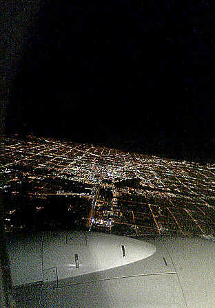 I know that the odds of being in a plane wreck are incredibly low, but then I think, by flying as often as I do I'm surely upping those odds at least a little. Then there's the fear that comes from looking out those tiny little windows and seeing the wing bounce all over the place. Sure sure, I know that for physics sake it's better that it do that, but I can't help but think it's about to break off at any moment. Or that one of those puny feeling plastic windows is just going to break. Or that the laws of physics are going to let us down (ha!) and decide to just drop us out of the sky. There are any number of perfectly natural, if irrational, reasons to be afraid of flying.
In spite of all that, the fear is pretty low on the radar. What really bugs me about flying is the extreme discomfort. In some ways flying with Matt is much nicer, because traveling with someone makes the trip easier. There is one key difference that makes it worse however: Matt is six foot four, and as such, gets automatic dibs on the aisle seat. Bastard.
When I was a kid I loved the window, but as I got older I preferred the aisle. It's not that I need the leg room, it's just that it allows me some freedom. Stuck in the middle, I inevitably need to use the bathroom pretty much incessantly, simply because my brain is perverse and wants me to suffer. Even if I do make Matt move so I can use the bathroom I pretty much need to use it again immediately as soon as I sit down because I'm STUCK AGAIN. And of course in the middle you're fighting two people for arm wrests instead of just one. At least because I know Matt I can lean on him, or feel less guilty about growling while fighting over the middle space (strangers look at you strangely and hit the call button if you so much as bare your teeth at them), but no matter what, the middle seat sucks.
It's nice when airlines take a little trouble to make flying more comfortable. There's not much they can do about the side to side room, so the middle person probably forever be screwed, but the last time I flew Continental on an international flight I saw an interesting solution to the upright problem. To fit as many people in as possible, seats are far too close together for comfort and that extra two inches you can get by putting your seat back doesn't really do much beyond pissing off the person behind you. On the continental flight however, the seats physically swung forward as you put your seat back, allowing your seatback to recline another several inches. It's AMAZING what a difference that made. Suddenly you can actually lean your head back, without fighting gravity. Brilliant. You don't really lose much leg room, unless you've got something stowed beneath the seat in front of you. These days I usually travel with my laptop stuffed down there and my backpack up above, which worked well since my laptop doesn't take much vertical space. I wish more airlines would do this, but I get the feeling that airlines just don't care. I know airlines are losing money around the board, and can't give quite the luxuries that they used to, but there are so many things they could do that wouldn't cost them any money at all. Running on time would be a nice step. We flew USAir this trip and it was dreadful. The only reason we didn't miss any flights (we had three) on the way to Oregon is because ALL our flights were late. There was no weird weather outside to justify it, they were just late. On our final flight we had a plane waiting outside and the pilot waiting by the desk. I went to ask when our expected arrival would be (since we were already running about an hour late at that point, and I'd just arrived from my flight which landed two hours late) and the pilot looked a bit shifty. "Well," he admitted, "I'm not sure where my crew is, so that depends." Ridiculous.
And if they're going to be late, the least they could do is try to be helpful along the way. Remember when they used to list during landing, all the connecting flights of people on the plane? Why on earth did they stop doing that? It doesn't cost them a dime and it would up my opinion of their customer service. It also would have been helpful, on those constantly late flights, not to have to stop and find out what gate we needed to run to. On the one really late flight, where Matt and I ought to have had about ten minutes to get to our gate (that's the one with the missing crew though so we really had an hour) it would have been nice too if they might have announced that our plane was delayed so we could have waited and let those with tighter connections go. They might also have mentioned those who had already missed their flights (about a quarter of the plane) so those people also didn't have to clog up the aisles. Sheesh.
It's not fear that's hurting airlines, fear of flying, fear of terrorism, fear of crowds or any other kind of fear. It's lousy planning and thoughtlessness. Honestly, put in a little effort, and those of us who have to fly will at least dread it a little less.
Wednesday, December 19, 2007
In-Direct
I despise malls. Great Northern Mall especially is a truly horrible place, with the shitty music from every store and kiosk competing with each other, the blinky lights and the jerky cell phone salesmen doing everything short of casting a net to attract your attention. That said, I have to admit that whoever came up with the idea of a mall directory was pretty brilliant. In a huge confusing headache inducing place like a mall, it's nice to know that every fifty feet or so there's a map to show you how to get to store you're looking for, or, if you've had all you can take, to the exit. Except that some moron at Great Northern thought it'd be great to hang smaller maps for your convenience... on top of the large lit map. Yes, I realize that I can just take one of the little maps and walk away if
  I really want to see what's hidden behind the plastic map holder, but come on, there's two square feet of white space down just below where they hung the stupid things. Or, if you don't believe most Americans will exert themselves enough to bend that far (and I guess I'm with you on that) how about hanging it on the side?
It's not like I needed to see what was on the map beneath the map holder, but since I couldn't SEE it, I had no way of knowing that. I happened to be looking for an electronic store and didn't see electronics anywhere else on the map. As it turned out that's because Great Northern doesn't have any electronics stores inside the mall which is just brilliant.  In fact all that was under the map was men's clothing and children's clothing. Granted, it's a long tradition of stereotypes to assume that men aren't going to check the map anyway but I think it's also a long accepted stereotype, and probably a more accurate one, that most grown men want to spend as little time in the damn mall as possible, which, logically, means checking the map and getting the hell out of there. And what about the kid's stores? If I were any of the stores covered up by mini-maps I'd be pissed, but I find it hard to believe that the omniscient Disney Store puts up with it. I smell a lawsuit.
Sunday, December 16, 2007
Why I hate Walmart
 One of the first space issues Matt and I ran into when we first moved in together was our over abundance of books. Together we had six tall particle board bookshelves, two wide pine bookshelves that we built together (Matt did most of it) and two small particle board bookshelves. It wasn't anywhere near enough.
We didn't really want to buy any more crappy particle board shelves, but we decided we'd better suck it up and get some cheap ones. Unfortunately our options were fairly limited. Target carries tall cheap bookshelves for thirty dollars, and we had three of those already. The older ones are a single piece, built as you might expect bookshelves to be built, but the newer ones, and the only kind you can find at Target now, are in two short pieces with pegs to hold the top half to the bottom. It looks horrible. I assume they do it to save on shipping costs, but it really just looks awful. Personally I don't like even the older ones because they're this horrid fake cherry color: the quality of fake wood has deteriorated rapidly, and it wasn't good to begin with. My shelves came from Meijer, apparently there aren't any of those nearby.  Ikea has ok looking bookshelves that are probably better quality, but they're still particle board and they're way more expensive. We're not really willing to pay sixty-eighty dollars for particle board furniture.
Which leaves us with Walmart. At Walmart I discovered some bookshelves that were not quite such a sickening color; fake oak is not nearly so offensive as fake cherry for some reason. Like the Target shelves they are in two halves, but unlike Target they don't try (and fail) to hide it. Instead they make it look like they really are two pieces that have been stacked on top of each other, and in my opinion the look is much nicer. The shelves looked slightly wider too, which has to be a good thing, right? So we went with those, for the same price as the Target ones. I know Walmart is famous for forcing it's suppliers to cut corners, but I didn't realize how much difference in quality there could be between particle board.
Our other shelves have shown some wear, a little bowing of the shelves but that's sort of to be expected with particle board. They don't necessarily sit parallel to the ground, but they're more or less straight. I've underlined each shelf in green so you can get an idea where these shelves are bowing.  Keep in mind, the shelf on the left I've had since college, so maybe five years? The other two are Matt's, he's had the one on the right for about two years, and the one in the middle, which seems to be having more bowing issues than the other two, for ages. So these shelves are doing pretty well all things considered.
 We got the Walmart shelves a few months after we moved here. Say September, though that's probably generous. That means tops, they're three and a half months old. Here's the Walmart shelves, with their underlines in teal.
In that short period of time the shelves are visibly bent, and I think the second shelf up on the right is actually resting on the Ikea magazine holders. I don't deny that they're overloaded, but ALL of our bookshelves are overloaded because we still don't have enough space for them. And seriously, three and a half months? I'm impressed, I mean, how exactly do you fuck up particle board? Is it eighty percent glue? Matt and I have always been resistant to buying from Walmart for many reasons, but we caved when we realized we were going to have to settle with crap quality wherever we went. How could we realize that the quality of crap could span so wide?
Thursday, December 13, 2007
Parking Peeves
 Sometimes parking is difficult. Some people are lousy parallel parkers for example. It takes them twenty tries to get into a huge spot, and by the time they're done I can almost forgive them taking up two spots with their little Neon or Corolla. Other times parking is badly designed or plotted out, either making it difficult to maneuver or hard to tell where it's ok to park. For some reason, the parking spots in front of my building are only marked about a foot and a half back from the curb. I can't think why they decided to do this, I'm guessing someone thought it was less ugly, but it's pretty idiotic. For most of the year it's ok, although I've seen at least one car that regularly manages to "not notice" where the lines are and parks any which where. In the winter however, after the first lasting snow, parking becomes a several month long nightmare. The little yellow lines appear to be exactly as long as the lingering snow, and it's impossible to tell where to park.
But that's kind of excusable, what amazes me are the people who park badly intentionally. I'll never understand what it is that makes someone think it's ok to double park. I realize that not everyone is a wonderful parker, and sometimes, even if you're just brilliant at parking (and what a skill that would be to brag about) it's just not possible to pull in at a good angle. But have we heard of backing out and straightening out people? Seriously? To my mind it is simply impossible that the above driver failed to notice that he/she was parked that horribly. They just didn't care. Fortunately another car was able to squeeze into the half space next to it, but forcing someone to do that is incredibly inconsiderate. I think in this case this was just laziness but there are at least two types of intentional double parking. The first is vehicles which are simply huge, and unless they're absolutely perfectly parked (and sometimes not even then) they're going to spill over into at least one extra space.
  Although I don't think much of gigantic cars, at least I can understand that in this case it's not necessarily willful thoughtlessness as it is a natural consequence. Of course if they'd get a car that didn't take up that much space, chances are they could get more than 6 miles/gallon too, so maybe there's more than one kind of indifference here.
The second kind of double parking is the jerks who really really really like their car, and think that, because their car is expensive/pretty/new they are somehow entitled to two spaces. I posted this picture a while ago, where we saw a silver car that believed this.
We saw this two weeks in a row, but the second week someone had decided to shimmy their way into the left hand half-space, and so Matt decided to park in the right hand half-space. Fantastic. Here's hoping the jackass learned something.
Tuesday, December 04, 2007
Watching Beowulf
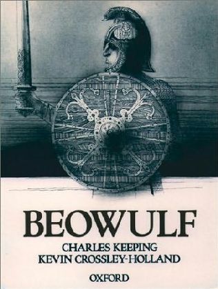 I should preface this review by admitting that I haven't read Beowulf
In all fairness, most of the negative reviews haven't focused on the movie's relationship to the book, nor really have the positive ones. This may be because everyone else has moved beyond the "They raped that book!" review, but I think it's far more likely that most of the reviewers have as vague of a memory of the actual poem as I do. I mean, I know the STORY, everyone knows the story, but details? It's just as easy to believe they got those right as wrong.
I have to say that this movie wasn't what I expected. For one thing, although most of the reviews I read were either bitching or raving about the CGI, I had no idea the whole thing was done in CGI rather a combo of live action and CGI like Spiderman or something. The CGI was good, possibly up there with Final Flight of the Osiris from The Animatrix
 The CGI was very good, and I'm always impressed with good CGI, but I can understand why people are complaining about it. The main complaint is that CGI will never have the liveliness of real human actors, but in this I think they're missing the mark slightly. The problem isn't that the CGI characters aren't expressive enough or alive enough, the problem, which is just a bit distracting, is that they aren't human. There's something a bit alien about them which we can accept in cartoons but not in creatures that are so close to being real. With a dog we might not even be able to tell the difference but we're so keyed into the visuals of what make human beings that it's impossible not to notice. Some day they may get to the point where it is indistinguishable but I'm not sure what the point of that is, the cool thing about CGI is all the weird stuff you can do with it. Which the movie Beowulf did take advantage of, in camera angles, character movement, and of course CGI monsters which were fully integrated into the story since they were no more CGI than anything else.
Personally, although I was often noticing the CGI, it didn't bother me and I was able to get easily lost in the story. I think the real problem with the movie was nothing in the movie at all: it was the previews.
I don't know whether anyone remembers the movie In the Bedroom
 It's not quite as far off as In the Bedroom, and in a way I think that might make it even more problematic, because people will go into the movie assuming it's the TRYING TO BE the same type of mainstream epic adventure/fantasy movie that they were shown in the preview. Instead we get something that's a little, but JUST a little bit off.
My main thought at the end of the movie was, yup, that screenplay was written by Neil Gaiman alright. If you go into the movie expecting Stardust

 On a side note, fantastic job by Brendan Gleeson, once again, in the best-friend-of-main-character role.
Images stolen from various places which they link to if you click on them.
Subscribe to:
Posts (Atom)