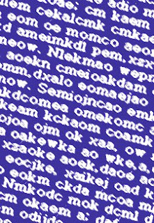
 If you've ever worked with OCR (Optical Character Recognition) software, software designed to turn scanned papers into editable text, you may have noticed that certain letter combinations are problematic for the computer. "cl" is often read as "d," "lc" turns into "k," and "rn" becomes "m." These aren't the only combos that cause trouble but they're the most common ones that I remember.
I would assume that this problem occurs more often with certain fonts and sizes, or with documents that are less clean, printers that are lower quality. While I can see how the characters resemble each other, I'd always though of this as a uniquely AI issue, until I found myself doing the same thing a couple days ago when checking my yahoo account.
One of the combinations I didn't mention was "ol," which potentially turns into "a." I didn't mention it because it's not a problem with most fonts. In most typefaces the "a" is as it appears here, with a... er... thinggy? curling up on the top and at the tail end. The "a" can appear though  as a circle with a barely curved line at the end, like an "ol." I made this mistake momentarally when I saw a granola bar ad from the corner of my eye. Maybe I was just tired. Personally though, If I were the designer, I'd be more careful about which font I used if I wanted to describe a product as having a "bold" taste. Or maybe he just doesn't like them.
A Certain Lack of Focus
Tuesday, March 11, 2008
Unfortunate Combinations
Subscribe to:
Post Comments (Atom)


No comments:
Post a Comment